The Last Straw
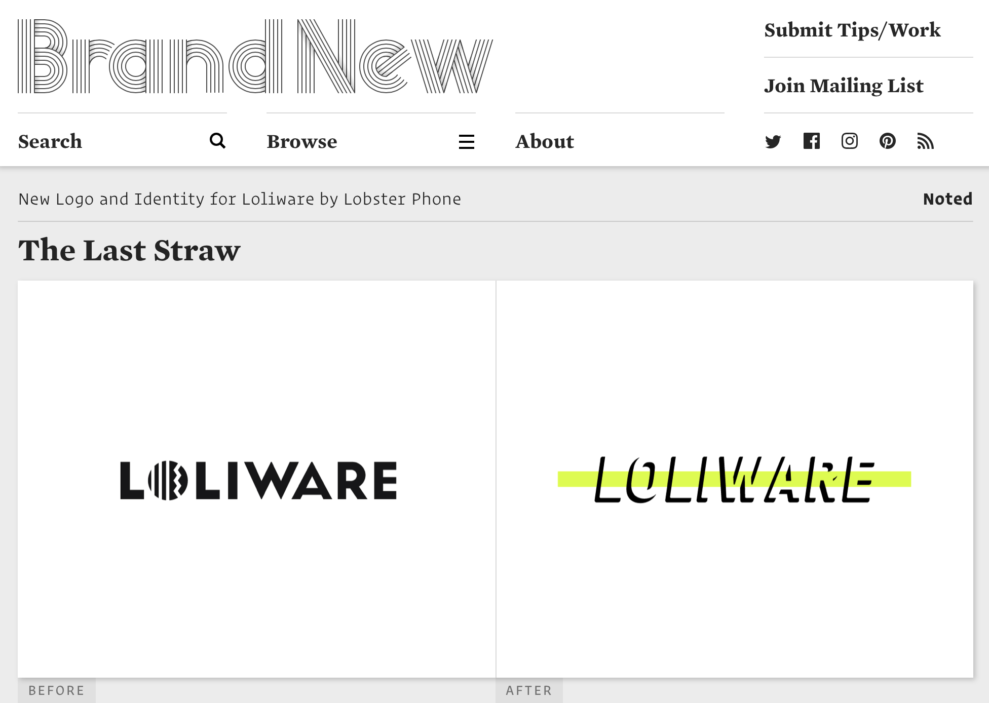
The old logo was okay but it had more of a fun/playful attitude in contrast to the new logo’s in-your-face, urgency attitude with the bright green strike-through graphic and italic wordmark. Once you know the company makes straws and that those straws are made to disappear, there is a great pay-off to the logo as the strikethrough stands in for the colorful straws and the shadow type is metaphorically disappearing. The identity uses GT America Mono in italic, uppercase, and neon green basically grabbing you from the shoulders and shaking you. I wish there was better integration with the photos in the background or the layouts made everything come together a little more convincingly or somehow link the rounded-ness of the logo to the harshness of the brand typography but I do like the unexpected boldness of the identity because it would have been easy for this to be all earthy-happy-save-the-trees-and-sunsets and pass unnoticed.